Target for iPad & iPhone

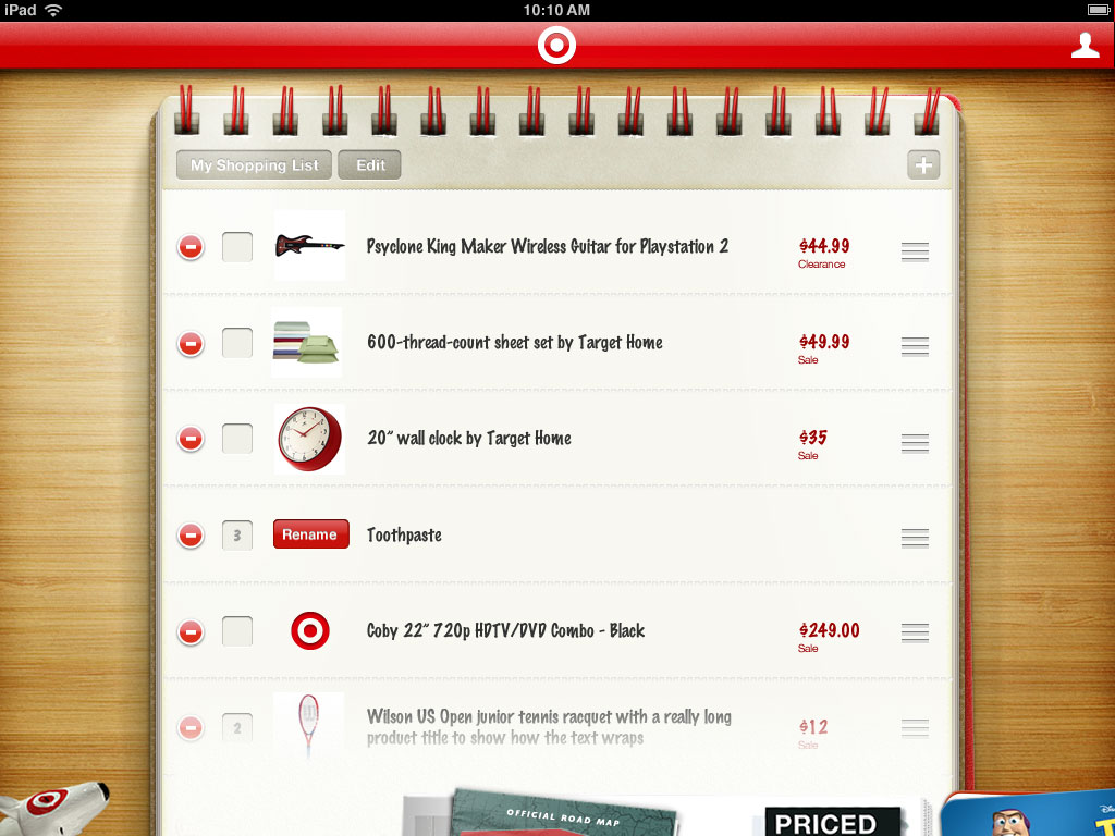
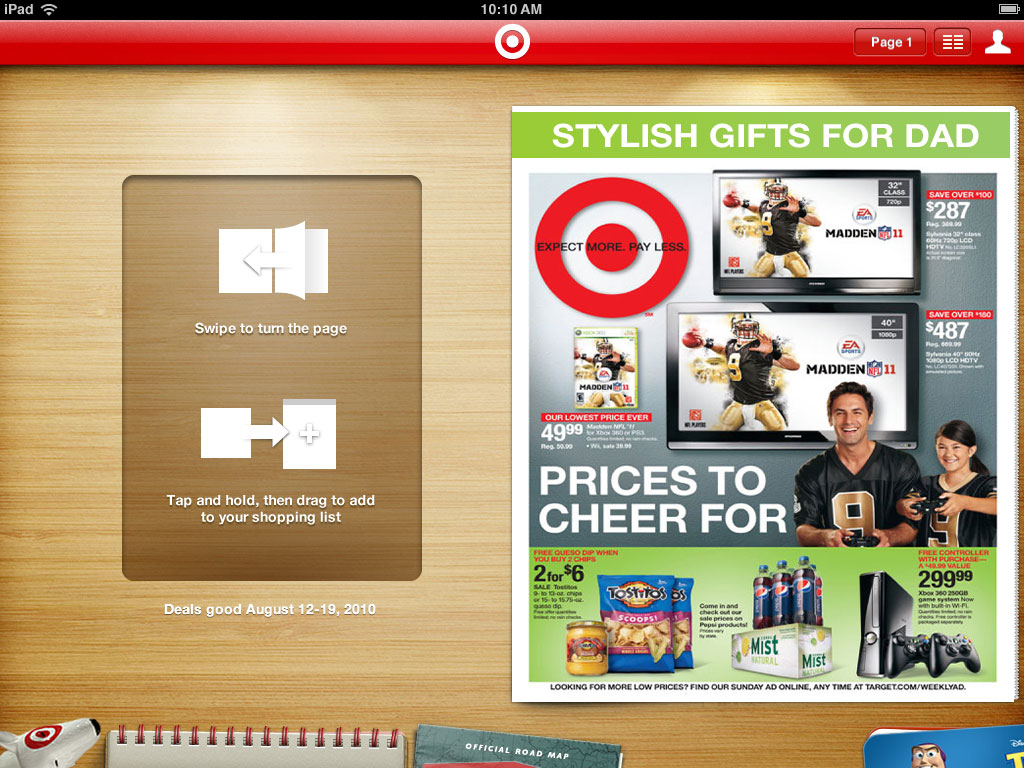
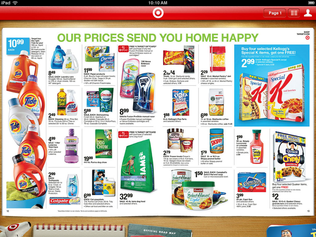
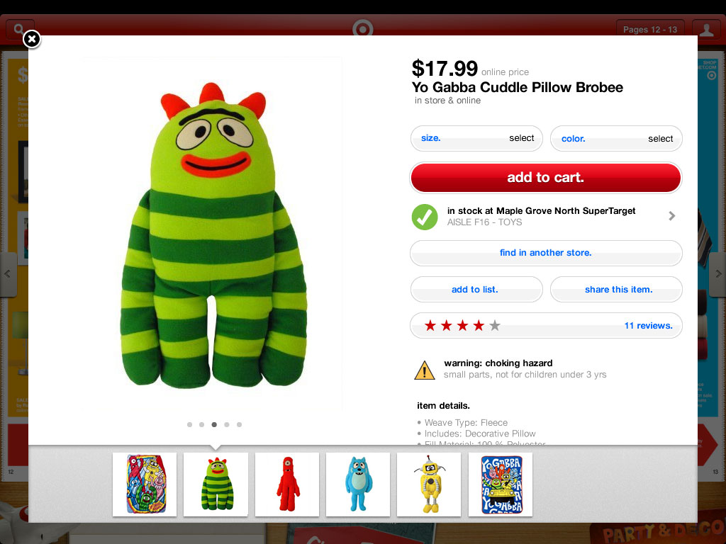
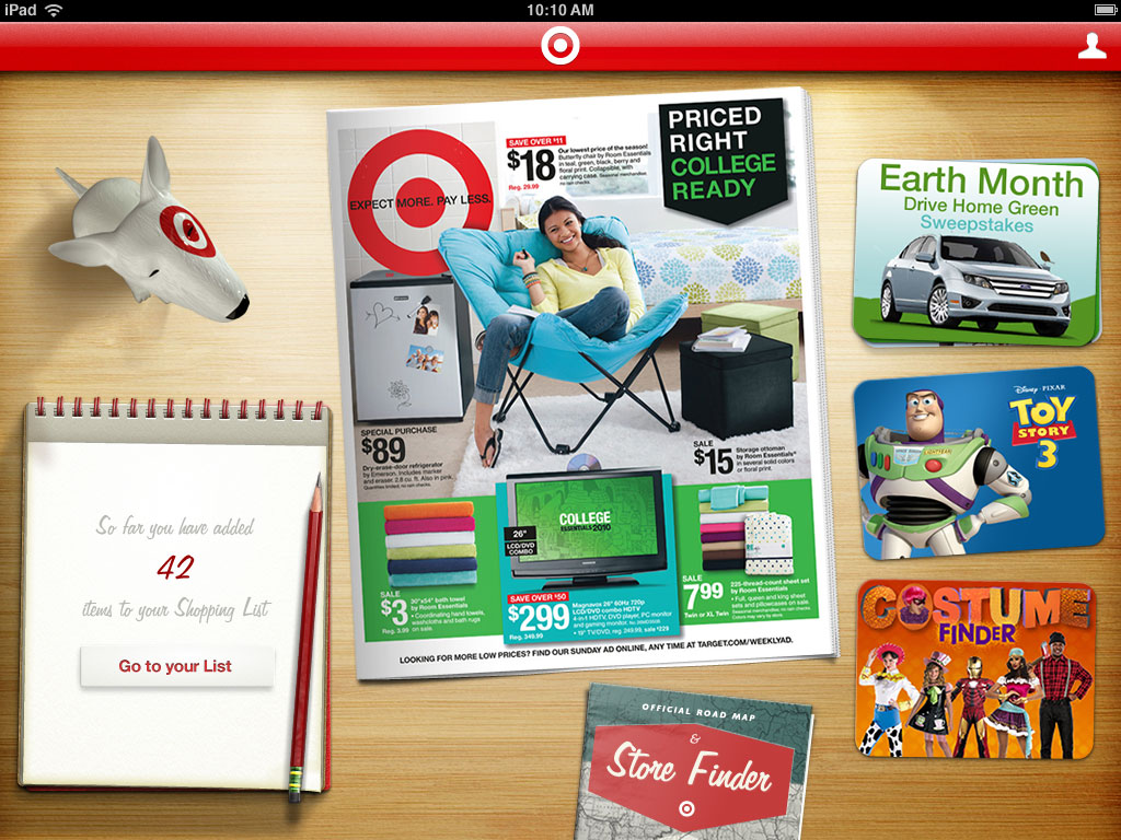
In 2010, shortly after Apple announced the original iPad, Target and Übermind worked together to launch Target's first iPad App. The plan was to recreate the Weekly Ad in the form of an app, complete with animated page turning, a coffee table metaphor, and all the skeuomorphic design that goes along with that.

Making Lemonade

Working with Restrictions

Target was working on a major overhaul of the APIs that would be used in their apps, but they wouldn't be ready for almost a year.

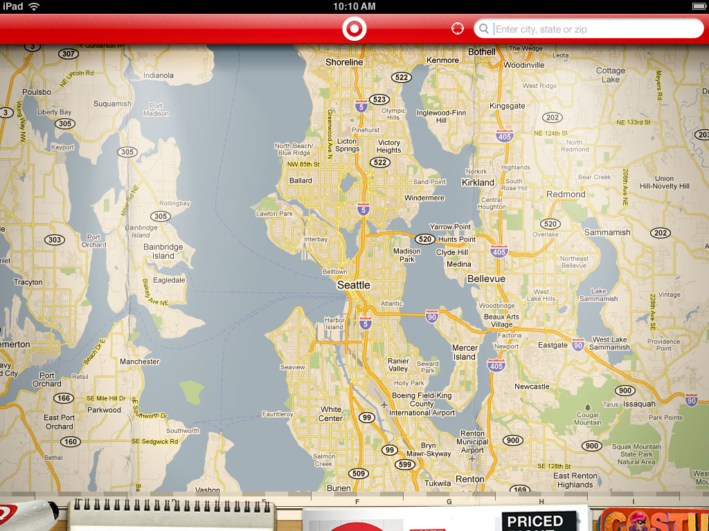
What we did have available were the services for the Weekly Ad and the Store Finder. Because of these technical limitations, the primary goal of the app became brand exposure, and to get people in-store. We wanted to create a rich-feeling app experience even though the app would not include many of the features consumers have come to expect from their apps.
A Feature Update

Adding Browsing & Searching

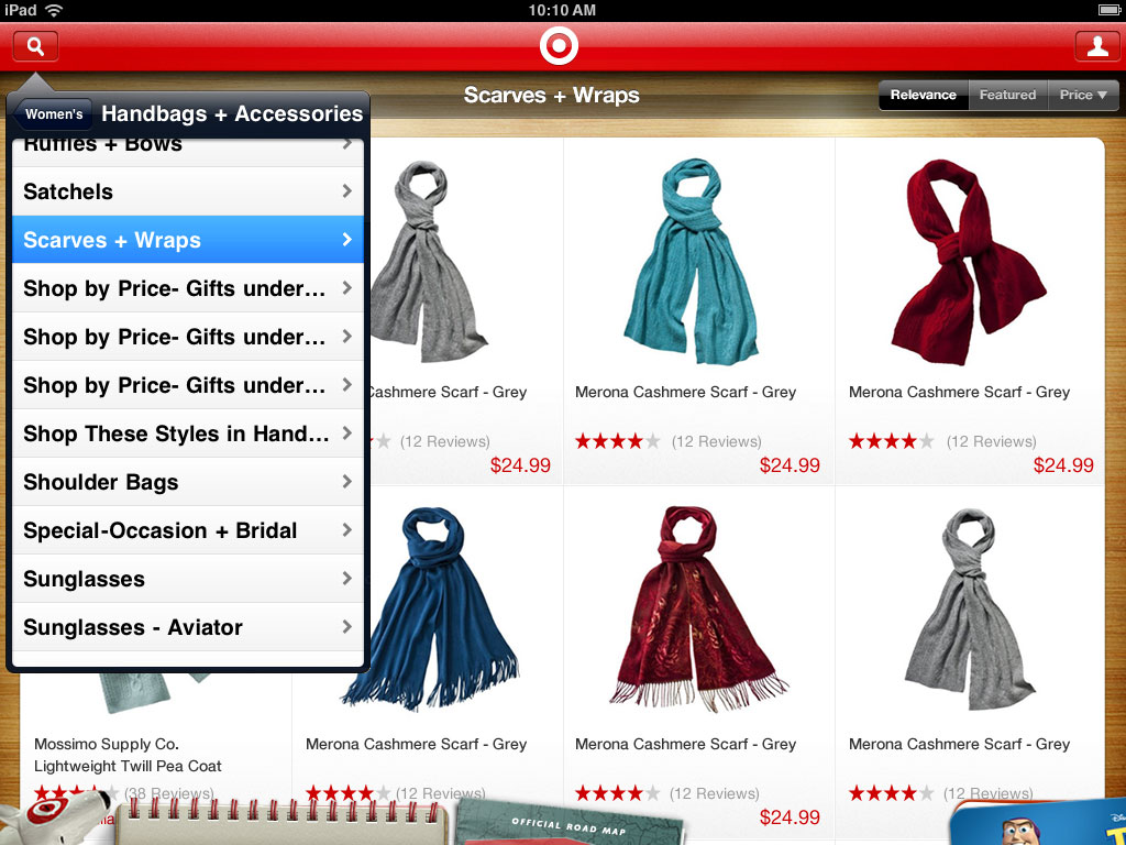
Later, some of the APIs started to become available, and we were able to add Product Browsing and Searching to the app. The app was due for a full redesign to account for these new features, but in the meantime, we wanted to get them into the existing app as quickly as we could.

Designing for Screens

Lessons Learned

People much more eloquent than I have written at great length about the issues with skeuomorphic design, many of which I experienced first-hand working on this project. It is fun to look back and remember how much time was spent trying to stick with the visual metaphors we had chosen. Textures had to look realistic, shadows and highlights had to be properly aligned to an imagined off-screen light source, and the objects on screen had to adhere to the physical properties of their real-world analogues. Things couldn't pop into existence, or scale up or down, or fade away. They had to slide around in 2D space, and they couldn't overlap in certain ways as they did. All for the sake of 'realism'.

I remember many conversations about how certain things should work - not because of any UX best practice, but because of the self-imposed limitations of maintaing the skeomorphic metaphor.

In the end, I found that shadow and texture can still help a great deal in directing attention or implying hierarchy, but they are tools rather than a foundation, and they should be used only with purpose and reason.

A Smaller Screen

A new Target App for iPhone, too

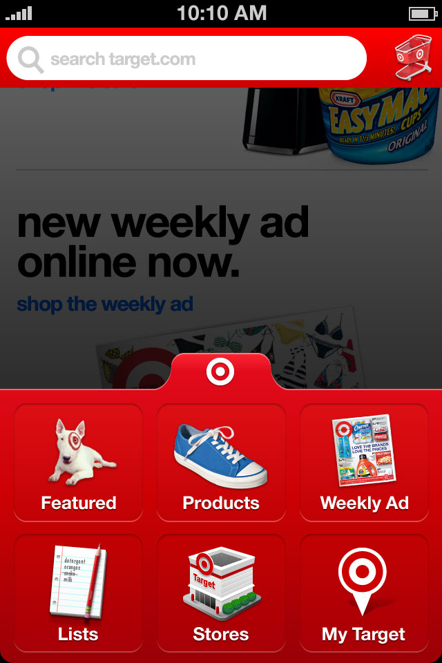
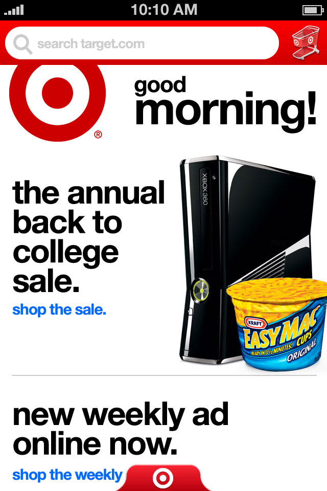
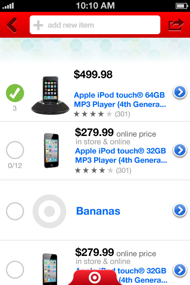
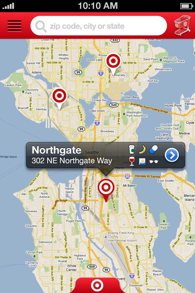
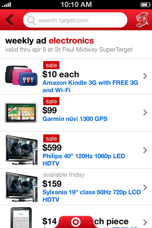
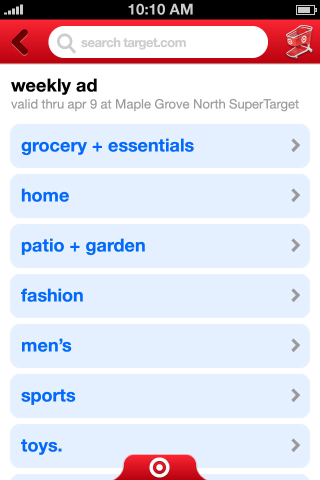
We also worked with Target to update and redesign their iPhone app, which included some new features like shopping lists and a store finder. We designed a custom navigation panel, which allowed for six sections, one more than would be possible on the standard iOS tab bar. At the time, hamburger menus were just starting to appear in other apps, but we felt that enforcing an upper limit of six was a better solution because it would help keep the app more focused.